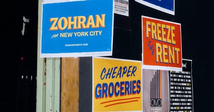
Zohran’s Campaign Logo Looked Nothing Like a Campaign Logo
By: Christopher Bonanos | Published: 2025-06-25 22:31:00 | Source: www.curbed.com
Photo: Jonah Rosenberg/The New York Times
Nobody would credit Zohran Mamdani’s campaign graphics for his win, but they were, like his campaign, like nothing else in politics. First, there’s the saturated color palette: A royal-blue field—brighter and more electric than Biden blue—backs up ochre-yellow letters with vermilion drop shadows. (Occasionally the colors are reversed, with the ochre as the background.) The typeface has curvilinear flourishes and flares that suggest the hand-painted lettering on a storefront sign far from politics, like the 1-Shot lettering enamel on a Washington Heights awning reading COLD BEER. Other…


